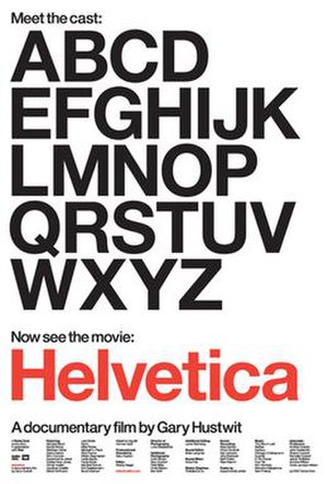
Fonts are all around us and they have become a bit more familiar after software such as MS Word or Apple’s Pages put them at the fingertips of their users.In this manner, terms such as serif, kerning, pica, point and boldface have become part of (almost) every day language. Similarly, the names of different fonts are familiar to many of us. How many times have you used Times New Roman, Lucida, Arial or Calibri? Or for that matter, have you noticed how many signs, ads, books, films and stationary use Helvetica?
If so, you would not be at all surprised to hear that there is even a documentary dedicated to the ubiquitous Helvetica! That’s right, Gary Hustwit’s documentary is a film about typography, graphic design and visual culture and if you are a bit of a geek like me, then you would definitely enjoy it. I had the opportunity to watch the film at the ICA in London this weekend, and I was very pleased to have seen it.
Helvetica was designed by Max Miedinger and Eduard Hoffman back in 1957 and its original name was “Neue Haas Grotesk” because of its relationship to the sans-serif German type Akzidenz Grotesk and because it was commissioned by the Haas Type Foundry in Switzerland. The change in name came about after the type began to be marketed internationally in 1961, and the rest is history.
The film came out in 2007 just in time for the 50th anniversary of Helvetica and shows a myriad of examples were the font is used and some of the reasons behind its proliferation. The film presents short interviews with some of the most renowned people in design: Massimo Vignelli, Hermann Zapf, Tobias Frere-Jones, Wim Crouwel, Jonathan Hoefler, Michael Bierut, etc. Their comments show the interesting relationship that we have, not only with Helvetica, but with other typefaces and with design in general. The font has its advocates and its detractors, but it is undeniable the impact that the font has had in the world over the past five decades.
So, if you are the kind of person that notices the wrong physics in films and complain about typecasting, i.e. notice when filmmakers used the right or wrong type for the period of the film, Helvetica is a film to watch.
Related articles
- New York Subway’s Long Dance With a Typeface (nytimes.com)
- Can you tell Arial from Helvetica? Put it to the test. (thenextweb.com)
- Hoefler & Frere-Jones
- Do typefaces really matter? (bbc.co.uk)
